

You Don’t Need a Door on a Formica Kitchen: Richard Artschwager and the Celebration of Imitation
The following is from the sales pitch written beneath a 1966 advertisement for the Formica Corporation, famed composite material company of the 20th century:

“You have an urge. For the deep glow of wood. And an elegant accent color. “But,” you say, “be practical, this is a kitchen!” “Right,” say we, “be practical.” And be elegant with cabinets and countertops of Formica brand laminated plastic. Maintenance? Soap and water! Refinishing? Never! Choose from warm, natural woodgrains (suede-finished to feel like wood). Accent with designer-inspired colors and patterns. Make your kitchen as pretty as you please, at very practical prices, too.”
As it shifted from the industrial sector to the decorative interior, Formica had to somehow maintain its high levels of performance with the new task of appearing aesthetically familiar. In other words, it had to act like plastic but look like wood. The “Miracle Surface,” as it was advertised, was designed to be more resilient than all domestic materials preceding it and yet visually indistinguishable from them. “You don’t need a door on a Formica kitchen,” another advertisement claimed, because they believed the product’s deceit was convincing enough to spill into the dining room. After the Second World War, the benefits of choosing Formica for a new home or renovation were widely undeniable. Homemakers and restaurant owners were quick to recognize the material’s intrinsic values relative to those of former building standards: its ease of construction, price point and durability made it a clear choice for a burgeoning middle class.
The only reason at the time to reject a plastic made to look like wood, however, was that it simply wasn’t wood. The urge for the “deep glow of wood” assumed by the advertisement belongs to a long history of wood as a significant building material. To this day, deep woodgrains conjure images of rustic cabins and furrow-browed studies halls that are miles and ages away from the places that long for them most. Everything that wood symbolizes is embedded within a decorative paper, further embedded within layers for wear and support.
With a composite imitating wood, Walter Benjamin might say, “the cult value of the image finds its last refuge.” Though Formica received its greatest sales when it was first advertised as decorative surfacing, many rejected the concept altogether, considering the new synthetic products on the market troublingly deceitful. The upper classes, intellectuals, and general traditionalists at the time maintained a firm hand against Formica and other assumed threats to conventional sensibilities. “To make plastic materials imitate woodwork,” insisted design critic Anthony Bertram, “is a definite dishonesty of design that cannot be too strongly condemned.”
As an artist that regularly employed the material in his work, Richard Artschwager has often been characterized by art historians as one of Formica’s most severe critics. This perception of the artist has largely been attributed to a segment of a 1965 interview where he described the product as “the horror of the age.” But the rest of his statement often goes unconsidered. The full quote is, “Formica, the great ugly material, the horror of the age,
which I came to like suddenly because I was sick of looking at all this beautiful wood. We have marvelous materials in our shop - gorgeous woods, absolutely the best that money can buy. But you look at acres of this stuff, and you don’t react to it any more.”
Artschwager, originally trained as a furniture craftsman and woodworker, had begun developing a series of sculptures entirely clad with Formica during the early 1960’s, just as it was becoming a household name. His optimism for the new product and lack of enthusiasm toward the authenticity of its predecessor is an unusual but ultimately refreshing attitude concerning the reality of modern innovations. When he described it as the “horror of the age,” he was not referring to his own opinion of the material, but rather that of the majority of those who reviewed it with either apathy or disapproval. For Artschwager, the material was not a source of complaint, indifference, or pure monetary value, as it had been for many of its customers and critics, nor was it a technological innovation without historical consequence, as it had been for the company’s marketing strategists. Formica was, for Artschwager, nothing less than a meaningful framework for art production and material culture. It was a product posing as a material. A liquid synthetic assuming the role of a carved solid. A curiously strange, new object that quietly and tenaciously made its way into everyday life.
But how did Artschwager celebrate a product popularly known as the “horror of the age” without compromising his values as an artist and a craftsman? Better yet, what was it about this futurist, historical artifact, ridiculed by its critics for its flatness and deceit of construction, that made it possible to celebrate without derision?
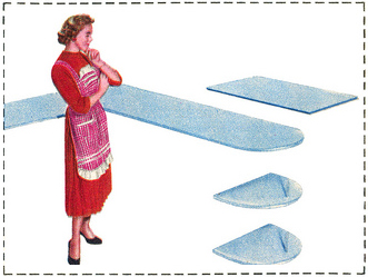
While Artschwager was arguably not critical against Formica as a product in itself, he appears to have been critical against its reluctance to reveal its inherent strangeness in everyday settings. Formica is a peculiar product, but it is also a shy one. In fine print, the kitchen countertops in the advertisement are colorfully labeled ‘Cantaloupe Finesse, 265’ while the cabinets read ‘Regency Walnut, 385.’ But contrary to its bold marketing, Formica cloaks itself and everything beneath in plastic armor while relegating itself to the background whenever possible. In the photo, the Formica kitchen surfaces are accompanied by objects older and heavier than themselves - bronze vases and mahogany cutting boards give the plastic underneath weight and depth where we now know it has none only by virtue of the advertisement. “Formica is visual muzak,” Jorg Heiser once observed, “like the soft tinkling of a piano playing on the edge of our perception, to insinuate a latent feeling of coziness.” The biggest surprise about the new domestic interior featured in the advertisement is supposed to be that there is nothing to see.

While Formica was designed to be quiet, Artschwager employed it to be loud. Consider his 1965 Piano. As a luxurious domestic object, the living room piano is supposed to appear as materially rich as the sound it is intended to produce. But this piano clearly does not play music, and it certainly does not contain hammers and strings inside. It is defined by the fewest amount of surfaces necessary to communicate the object, ‘piano,’ while abstaining from any function expected of it.
The keys line up flush with the casing, allowing no room to rest one’s hands. The wood grain does not signify a solid mass as it turns corners, and where two edges meet, there is a hollow interior, revealed as a grainy black line. The ebony, ivory, copper and oakwood all bask in the same satin sheen. And while an ordinary piano is expected to make a dent in the floor under its own weight, this one appears to levitate just above the shag beneath.
Artschwager shed none of his prior skills as a craftsman in producing this piano. Its corners and edges are constructed just as flawlessly as those of Donald Judd’s boxes or John McCracken’s leaning slabs. It does not reveal its flatness by accident or misalignment, nor does it hide its details under veils or the pretensions of cloaking devices.

His decision to treat Formica as a serious element of craftsmanship reminds us that despite its claims to its own ease of construction, a high level of detail and handiwork will always be required for it to produce its intended effect. In the built environment, Formica is only unmasked when it is poorly crafted. If glued unevenly, cut improperly, or damaged in the process of construction or use, the gap between its communicative value and the reality of its layered assembly will come undone in a display that the Formica Corporation would itself find unacceptable. Artschwager’s piano, by contrast, communicates the reality of its construction not through imperfection but rather an almost comical reliance on the product itself. By asking the laminate to pose as four distinct materials side by side, this piano makes a fool of no one, as it happily reveals its true nature from any distance. This piano therefore does not ‘expose’ the deceit of Formica so much as let the product speak more clearly for itself than it can in its more typical commercial roles.
Consider Artschwager’s piano placed in the dining room of the house in the advertisement. How offensive would its fraudulence be among its own kind?
To place this piano anywhere near this kitchen - one loud and the other quiet - would allow the viewer to draw the relationship between the two, thus revealing the deceit equally present in both. “You’d have to touch the siding to be convinced it is laminated plastic,” the Corporation once challenged. But in this juxtaposition, the familiar proportions of the kitchen-set no longer imply its intended functionality against the clearly inoperable piano beside it. The discernment of this interior’s material qualities go beyond the purely tactile, to enter the venerated realm of the visual.

Because his piano is, in fact, a sculpture, and not a piece of furniture, the visual is the only realm where its material properties can be apprehended, leaving the viewer with hands-off detective work. His piano withdraws from the functions expected of it to most clearly reveal the smooth, functional surface of its communication. His use of Formica was, in his words, “a celebration of the material you lean your elbows on in twenty per cent of the luncheonettes [in America]. When you separate it from that,” he believed, “it’s pretty marvelous.”
To borrow a phrase from Michael Fried, Artschwager’s choice to imbue this reticent product with a ‘theatrical’ quality became a means of celebrating its unique features. Fried’s 1967 essay ‘Art and Objecthood’ described the new object-based, literalist art of the 1960’s as inherently valued by conditions beyond itself, including scale, siting, and ‘presence’ in a room. Though Fried did not reference the artist explicitly, his claim that “a kind of latent or hidden naturalism, indeed anthropomorphism, lies at the core of literalist theory and practice” places Artschwager’s work squarely within Fried’s definition of objecthood.
And though Fried used it as a condemnation of the fusion of the terms ‘art’ and ‘object,’ Artschwager might have welcomed the term ‘theatrical’ as an accurate and even flattering description of his sculpture. Even in a typical gallery setting, this piano carries the elements of theatricality Fried described, if at least for the reason that it shares with most literalist work an implication of a functionalist and scalar relationship to the viewer that quickly gets denied by sight alone. Because Artschwager believed that his work “takes place about one step away from the normal stir of human activity,” his piano might have especially felt at home adjacent to a Formica kitchen - even if it was not invited. The effect would indeed be theatrical, and not unlike the final act of an opera, when the multiple lovers are finally revealed to each other.
Perhaps Artschwager felt cause to celebrate Formica because this plastic composite was, like so many other plastic composites, “a spectacle to be deciphered,” as Roland Barthes described, “the very spectacle of its end products.” As a wood craftsman, Artschwager developed the habits of carving, sanding, and chamfering. But as a Formica craftsman, he expanded his skills, to include cutting, pasting, and everything else expected of a latter-day artisan.
As his piano entwines the infinitely pictorial flatness of Formica with the mute support underneath, it represents a new whole that is uniquely afforded by the modern methods of industry. As Walter Benjamin claimed, “It’s being reproducible by technological means frees the work of art, for the first time in history, from its existence as a parasite upon ritual.”
No longer encumbered by the limits of previous methods, his astonishment over this new phase of image production could then be a source of pleasure, since it is, Barthes continued, “precisely plastic’s itinerary which gives the euphoria of a prestigious slide through Nature.” The significance of the piano’s relationship to Nature is spelled out on its surface and the void of its edges - first by conquering Nature through bypassing the growth of its forests as a direct visual resource, then again by its appropriation as a paper-thin facsimile.
“The old illusions of relief, perspective, and spatial and psychological depth linked to the perception of the object,” Jean Baudrillard wrote, “give way to an optics functioning on the surface of things, as if the gaze had become the molecular code of the object.” Only in a section can we see for ourselves the special effect in full; a binary opposition between a communicative surface and a hollow armature. The final step of adhering Formica was emblematic of the new task of craftsmanship that was to define the 20th century. Both Artschwager and the Formica Corporation were well aware of the primacy that visuality holds above the other senses for a modern audience; how they chose to handle this fact is what most clearly set them apart.
In a blurb for Art in America, Artschwager wrote that the aim of his work was to imbue it with “qualities of grace, beauty, monumentality, reverence, sense of purpose, sense of the eternal, purity, truth, craftsmanship, significant form, durability, honesty, and strength - singly or in combination.” To align this aim with the material regularly met with scorn and apathy was an optimistic, and maybe even earnest pursuit - one that promoted new scales of literacy over both the idealism of its harshest critics and the indifference of its busiest customers. Artschwager did not want Formica to stop being dishonest - rather, he wanted to put its dishonesty on display so that the audience that enabled its existence may also be able to properly describe it.
Nearly all of Artschwager’s work mined the limits of recently developed materials - including Formica, Celotex, Rubberized Horsehair, and acrylic - to reveal them for exactly what they were: entirely new technologies predicated on old sensibilities. “Science and technology revolutionize our lives,” Arthur Schlesinger reminds us, “but memory, tradition and myth frame our response.” Artschwager’s acceptance and celebration of Formica was, without contradiction, an embrace of both its appeal to progress and its affirmation of tradition. He was expressing what Susan Sontag described as “the love of the unnatural” so that his audience may identify it in its more familiar settings - and, perhaps, revel in the pleasurable surprise John Ruskin observed of, “a resemblance so great as nearly to deceive,” the same excitement of mind ”as that which we receive from juggling.”
So the artist might have agreed with the Corporation’s tagline - you don’t need a door on a Formica kitchen, because while there is a growing concern that imitative materials might incorrectly color or dull our judgements, they may also be an opportunity to sharpen them.

